Listed on 
Don't have an account?
Register via AppHave an account?
Login
Don't have an account?
Register via AppHave an account?
Login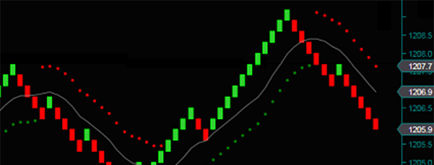
As far as financial trading is concerned, increasing your awareness is considered a good thing. It follows that knowing some of the background and history of your trading instrument will invariably work to your advantage. Keeping in touch with Federal Reserve monetary policy and the macroeconomic climate can be of assistance too. And when it comes to the price activity of your instrument, we similarly aim to gain as detailed an impression as possible. Candlestick charts, for example, are so popular because they reveal the nuances of price activity in the struggle between bulls and bears within a trading session, all the way from the beginning, throughout the lows and highs that occur in the day, until closing time.
And yet, we know of many situations in life where we might want to limit the information to which we are exposed. Imagine if your news provider informed you about every crime committed anywhere in the world, every single day. Or imagine knowing everything your spouse has ever said or thought about you since you have known them. In some cases, you’re better off not knowing. And the reason for this is that too much information can be paralyzing.
This is why many traders like to use Renko charts when analyzing their asset’s price movements. Renko charts are designed to block out the little price jumps that can obscure the broader trend you need to recognize. Once the smaller price swings are cut out of the picture, buy and sell signals can stand out a lot more strikingly. This is why lots of professional traders, with years of experience using candlestick charts under their belts, tend to turn to Renko charts to get the clarity they need. Let’s learn a bit about Renko charts and the ways they can improve your online trading strategy.
For a start, a Renko chart is not a candlestick chart, so don’t expect it to do the same things that candlesticks do. Candlesticks are like little summaries of the drama that occurred within trading sessions, as we mentioned above. Since their aim is to tell the story of what happened in that time period, they work with a time axis that is fixed and uniform.
Renko charts don’t care a pixel about the daily drama in the struggle between market bulls and bears. The only question they ask is: What happened to prices? If nothing substantial happened to your asset’s prices in a trading session, a Renko chart won’t record that session at all. If, however, prices climb by three box sizes, your Renko chart will record three fresh green bricks corresponding to that session. The box size is just the minimum price movement that you deem significant for your asset. You could set it, for example, at $0.20 for shares trading, or at 10 pips for a forex pair, but, in both cases, you should take into account the normal volatility level of the instrument you are trading. Once you have set your box size at, say, $0.20, your Renko chart will fail to register price movements of $0.19 or less.
The smaller you set your box size, the more activity you are going to see on your chart, since it will register smaller movements, whether up or down. On the one hand, this may be helpful because you’ll perceive price reversals more quickly when they occur. But, on the other, you will start to lose the key benefit of Renko charts, which is to block out the smaller, jittery price jumps. Renko traders don’t want to be led astray by those anxiety-induced fluctuations in prices, so they deliberately set up their charts to miss them out. It’s in this way that they get the trading signals that they need.
In the Renko chart below, you can see, on the left-hand side, a series of descending red bricks, each one signifying a box-sized drop in prices for the given asset. The green bricks in between indicate that prices climbed back up by a box-sized amount. Any time prices remained stable or jumped less than the box size, this would not feature on the chart at all. Similarly on the right-hand side of the chart, when the bull run gets going, only box-sized price leaps and drops make it onto the chart.
When it comes to identifying support and resistance levels, where dropping prices find some rest and rising prices meet a roof, respectively, Renko charts do the job very well. Renko charts also excel at revealing trends in the making, which otherwise might be hidden among a tangle of price vacillations. In the Renko chart above, you can appreciate the clarity they offer in displaying relevant price trends, both bearish and bullish.
On the left-hand side of the chart, there is an unmistakable downtrend marked by two bullish pullbacks in prices. For the trader who has positively identified that downtrend, (perhaps through using volume or momentum indicators), the single green pullback bricks provide unequivocal entry signals for short trades on the asset. In the arena of financial trading, it can make a big difference to have clarified your approach quickly and conclusively while other traders are still wrestling with doubt.
Moving towards the right-hand side of the Renko chart above, where the uptrend gets going, we again see the power of the chart to offer clear, actionable trading signals. There are two red-bricked pullbacks to this bull run – one near the beginning and another around the middle – which function as great buy signals, particularly once prices resume their upward climb. From all this we see how Renko trading strategy is characteristically straightforward, seeking to eliminate ambiguity.
If those smaller price fluctuations are the bread and butter of your trading strategy, Renko charts are probably not for you. As we have explained, these charts have trained their ears to block out the white noise of daily price jumps. They are thus ill-suited to taking advantage of tiny price oscillations.
And, if you need to know the exact high point reached by prices, you are likely not to find this anywhere on your Renko chart. When rising prices turn around before completing a full brick, the peak that they form will not appear on your screen. For instance, if your box size is $0.50 and the latest brick brought prices for your instrument up to $115.75, a surge to $116 will fail to register on your chart. The reason is that this $0.25 movement is only half of the required box size. Thus, prices may touch $116 and turn around, dropping through the $115.75 level, without so much as a blip showing up on your screen. In fact, prices would have to fall a full dollar from their original level, all the way to $114.75, before your Renko chart would display a single red brick. This is because Renko charts only record price drops of 2 box sizes or more when occurring after bull runs.

Still, none of this need turn you off Renko charts. Stop loss orders are the perfect tool to effect your timely exit from such situations, since they close your deal automatically when falling prices meet a certain pre-chosen point. Plus, many Renko traders use other technical indicators in conjunction with their charts. A wider range of price information is then available to them, which helps them avoid this sort of problem. For example, lots of traders consult the MACD momentum indicator to keep track of trend strength between glances at their Renko charts.
When you look at a Renko chart for your asset, you are probably not going to see the most up-to-date prices available on it. The newest brick recorded will signify, not the events of the latest trading session, but the last time a price move exceeded the box size amount. This, in theory, could have occurred as long ago as two weeks. By contrast, a candlestick chart will display the most recent prices for your instrument, as long as it’s running on real-time quotes.
In determining the role Renko charts take on in your trading strategy, you should consider, not only your personal style in approaching the markets, but also the nature of the asset you’re dealing in. And, with the wide range of trading tools and technical indicators available to you on today’s online trading platforms, it would be hasty to put all your eggs exclusively in the Renko basket.
What Renko charts do offer is a vivid representation of your asset’s most prominent price behaviour, and this continues to prove useful to online traders despite the fancier innovations in online trading that have lately emerged. The reason for this is that traders continually strive to act with poise and decisiveness in the marketplace, and Renko charts were especially created to bring this to the table. Why not give them a try and see how they work for you? After all, you don’t have to officially convert to Renko trading strategy in order to benefit from the structure of these charts. While you do so, it can be especially helpful to listen to professional traders explain their penchants for Renko trading.
The materials contained on this document should not in any way be construed, either explicitly or implicitly, directly or indirectly, as investment advice, recommendation or suggestion of an investment strategy with respect to a financial instrument, in any manner whatsoever. Any indication of past performance or simulated past performance included in this document is not a reliable indicator of future results. For the full disclaimer click here.
Join iFOREX to get an education package and start taking advantage of market opportunities.
 A beginner's e-book
 $5,000 practice demo account
 A 12-part video course
 Trusted partner
 Featured partner